MOTI Project Photos

The prototype that started it all.

Testing variations of light interactions. User testing showed a strong preference for the near-ephemeral quality of a neopixel ring recessed below semi-opaque plastic.

The first “alpha” prototype of MOTI, bridging a new shell design with internal electronics. The was the first joining of lights, sounds, haptics, and connectivity.

In parallel, I was still building prototypes of wearables for behavior change. However, battery life and forgetfulness presented significant hurdles.

The first alpha unit being testing in the wild. This study yielded a new side benefit to MOTI: the subject’s coworkers started to engage with his habit formation, giving out high fives whenever they saw him hydrating (his habit of choice) and leaning over to push MOTI’s button.

This video shows how we fabricated our 35 beta devices. They were proudly made by all female engineers!


Beta units ready to ship — at this point there were three form factors and five colors to choose from. We would quickly learn the need to minimize SKUs.

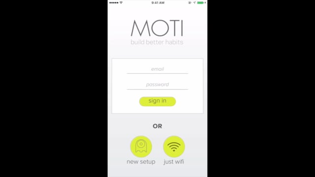
Planning out the user flow of the mobile app. The mobile app was required to set up MOTI, and could be used to track stats and remotely “push” MOTI if away.

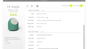
A look at the MOTI Beta web portal.


A look at a later iteration of the MOTI App on-boarding process. You could use the mobile app to also view the same information as the web portal.


In 2015, MOTI was accepted into Highway1, which focuses on scaling manufacturing for startups. We moved from New York to San Francisco, and started a new phase of the startup journey.

I conducted extensive user testing on the user interactions and form factors for MOTI. This shot shows variations on how a user would “tell” MOTI they have done their habit. Users strongly preferred the Pavlovian satisfaction of a physical push button.

An exploration into MOTI’s feet.

Scale studies. MOTI had to be small enough to not take up too much space on a bedside table or messy desk, but big enough to be paid attention to.

We made a switch to a concave face after noticing that our mentors would always pick up the MOTI prototypes and rub it’s face absent-mindedly during meetings. We also experimented with alternative, softer materials for the faceplate. Getting the face right was one of the most important elements of MOTI’s design. We also paid attention to the face-to-body ratio to best convey the feeling that MOTI was a living being.

We went to Shenzhen with Highway1, and explored throughout Huaqiangbei to try and find the best LEDs, haptic vibrators, and pushbuttons for MOTI.

We also walked a number of manufacturing lines while there.

A key moment for MOTI is the push — it needs to be tangibly very satisfying in order to build that dopamine rush when a user completes their habit. We paid close attention to the exact force and travel curve of off-the-shelf and custom pushbuttons.

The form factor of the faceplate also played a big role in the feel of the push.

Eventually all this prototyping and testing led to the final form factor and interactions set. With the help of Highway1 and some contract engineers, we designed MOTI to be manufacturable with injection molding and a custom PCB. (I will always remember spending some long nights with the pick-and-place machine in the shop.)

We found a wonderful silicone molder in Shenzhen with stellar painting skills. Color choices are always hard and require on-hand prototypes before moving to scale.

We couldn’t forget about the packaging. It’s one of the first touch points a user has with a new product, and very important to branding.

All in all, we built over 100 prototypes leading up to the final product.